Template:Infobox/doc
Description
Use this template to add an infobox of the card's stats to the page. It'll nicely organize the stats of the card into a box on the right-hand size of the page. The infobox displays the following:
- Card Name
- Full card or charm image
- Health (or Scrap)
- Attack
- Counter
- Other stats (e.g. Frenzy or Teeth)
- Card or Charm description (in different colours)
- Card art (optional, and collapsed by default)
Usage
This template can be used by entering the following onto a relevant page.
{{infobox}}
There are a number of parameters that you can add to an infobox. If a parameter is not filled in, it will show up blank.
- name - The name displayed at the top of the infobox
- image - The image filename, including filetype (e.g. ".png")
- width - Image width override (in format XXpx), default is 285px
- category - The category type, can be set to 'Charm' to override and hide non-charm infobox sections. Default value is 'Card'
- hpType - Enter "heart" or "scrap" depending on the card; defaults to hearts
- health - Health counter, regardless of heart/scrap
- attack - Attack damage value
- counter - Card counter value
- other - Additional basic stats such as Frenzy or Teeth
- description - Card description/effects
- desCol - Colour of the description text
- art - The art filename, including filetype (e.g. ".png")
Samples
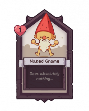
| Naked Gnome | |||
|---|---|---|---|
| 1 | |||
| Other Stats | |||
| Card Description | |||
| Does absolutely nothing... | |||
|
| |||
{{infobox
|name=Naked Gnome
|image=Naked Gnome Card.png
|hpType=heart
|health=1
|description=Does absolutely nothing...
|art=Naked Gnome.png
}}
This info from the Naked Gnome page will display the below example. Note how values we did not include show up only as empty boxes. This is helpful in distinguishing if there is a value present or not. Remember: a card that hits another card when activated should have an attack value, which can include 0. Cards that do not hit other cards when activating should not have an attack value. Note: the infobox will always want to display on the right-hand side with content wrapping around the remainder of the screen. The infobox itself has a fixed width.
If the other values are included, the results would look like the second infobox on this page (note: the image doesn't match and the stats are made up):
{{infobox
|name=Naked Gnome
|image=Naked Gnome Card.png
|hpType=heart
|health=3
|attack=4
|counter=5
|other=x3 {{Stat|Frenzy}}
|description=Does absolutely nothing...
|desCol=grey
}}
| Naked Gnome | ||
|---|---|---|
| 3 | 4 | 5 |
| Other Stats | ||
| x3 | ||
| Card Description | ||
| Does absolutely nothing... | ||
Multiple Infoboxes
If you are trying to include multiple infoboxes on a page (such as this template page), you will need to include some code to reset the styling applied to the box. Without the following code, your infoboxes may display side-by-side. As long as the following code is between the infoboxes, they should display above eachother.
<div style="clear:both;"></div>
In practice, this is how it should look:
{{infobox}}
<div style="clear:both;"></div>
{{infobox}}
or
{{infobox}}

Some written content goes here.

<div style="clear:both;"></div>
{{infobox}}
Whenever including multiple infoboxes on the same page, expect some awkward display issues. Just look at this page for example. Having content long enough to space out the infoboxes is key in having the best presentation on a page, but it may not be easy to achieve.

